Watershed Artworks Society is a Not-For-Profit Society in North Delta celebrating more than 13 years of providing opportunities for local member artists to display, promote and sell their works. We represent a diverse range of unique handmade work from local painters, potters, glass blowing artists, welding artists, textile artists, and others.
PROJECT BRIEF:
Part 1: To analyze data from Google analytics and Search Console insights and provide recommendations on improving audience retention online. This includes making an audit of the website including SEO score, page speed, text and visual content, and UI/UX.
Part 2: To suggest and implement improvements to website UI, social media content strategy, gallery events, & art classes. This includes making small to somewhat significant website and branding changes to modernize and bring the brand's presence across channels up to date.
SOCIAL MEDIA UPDATES
INSTAGRAM:
Updated bio from blank to a brief and straight-forward introduction to new visitors and existing followers.
Added highlights to warm up visitors to events and programs they may be interested in.
Updated bio from blank to a brief and straight-forward introduction to new visitors and existing followers.
Added highlights to warm up visitors to events and programs they may be interested in.
IDENTIFYING OLD TEMPLATE ISSUES:
1. Graphics covered up most of the artwork and used all three logo colors in full capacity.
2. The previous template was used in red, blue, and yellow colors
3. The caption provided no information on the art and the artist
4. Excessive use of hashtags and no interaction with the posts
1. Graphics covered up most of the artwork and used all three logo colors in full capacity.
2. The previous template was used in red, blue, and yellow colors
3. The caption provided no information on the art and the artist
4. Excessive use of hashtags and no interaction with the posts
OVERALL UPDATES:
1. Introduced brand color usage effectively to ensure social posts resonate with visitors
2. Designed a group of templates in photoshop that seamlessly integrates a diverse range of 2d and 3d artworks
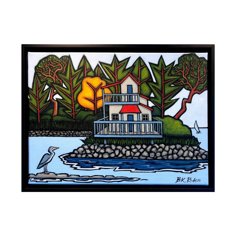
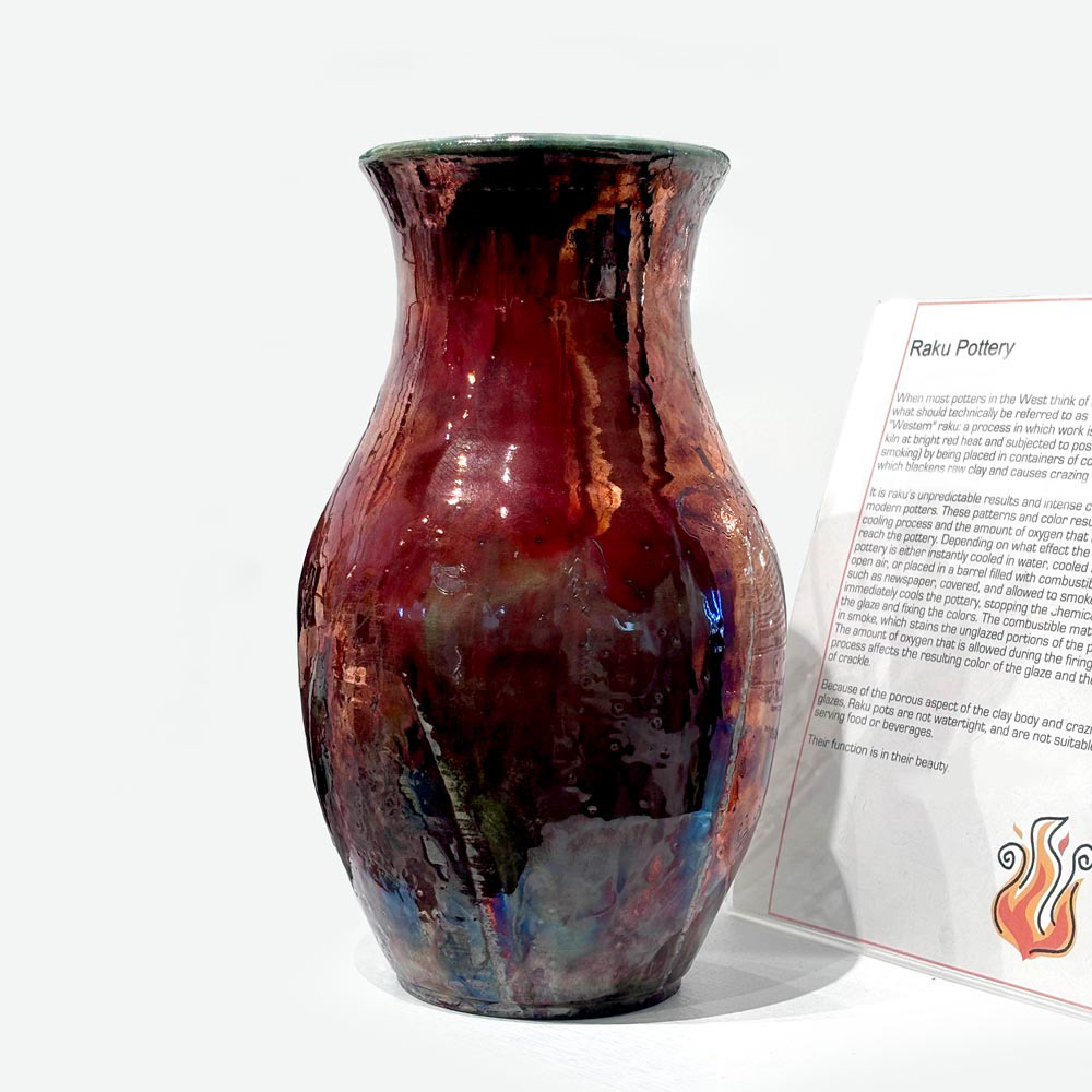
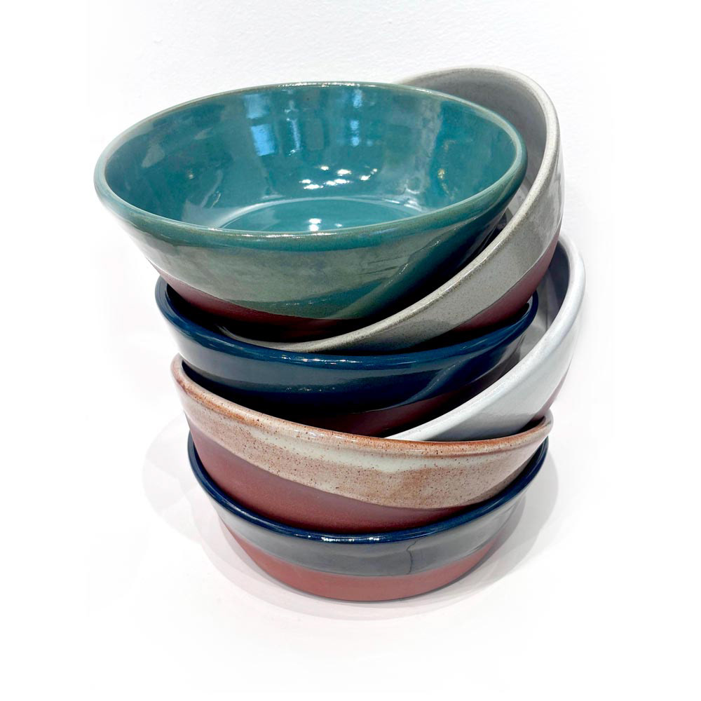
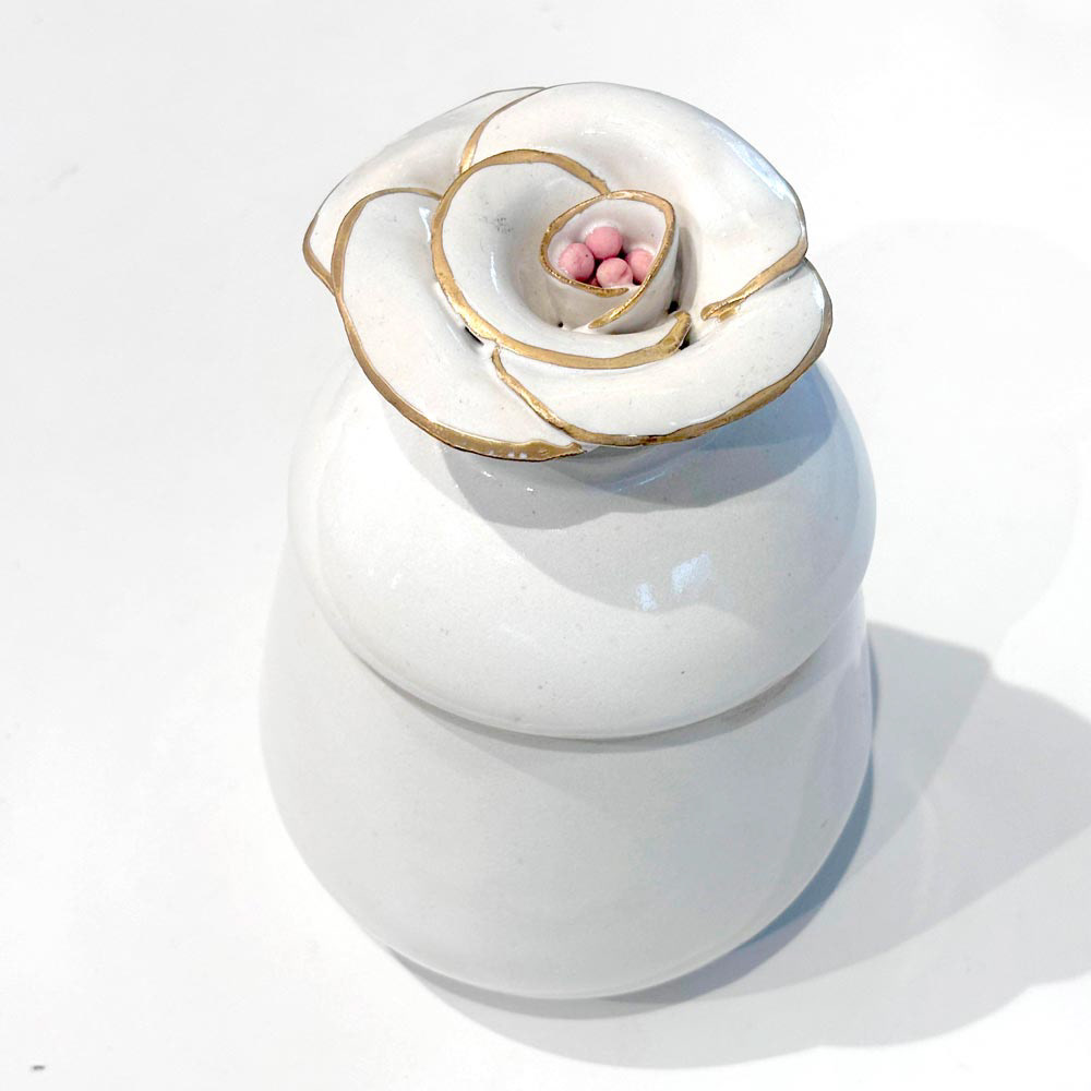
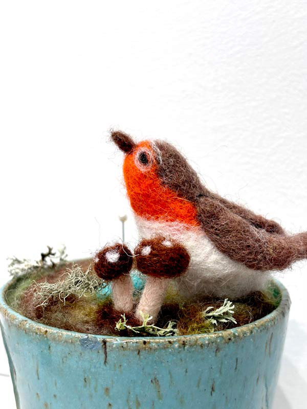
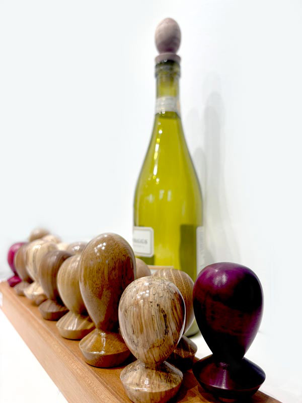
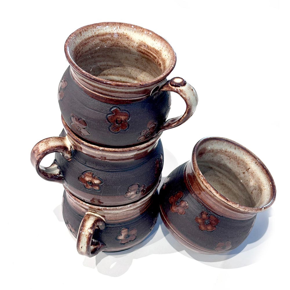
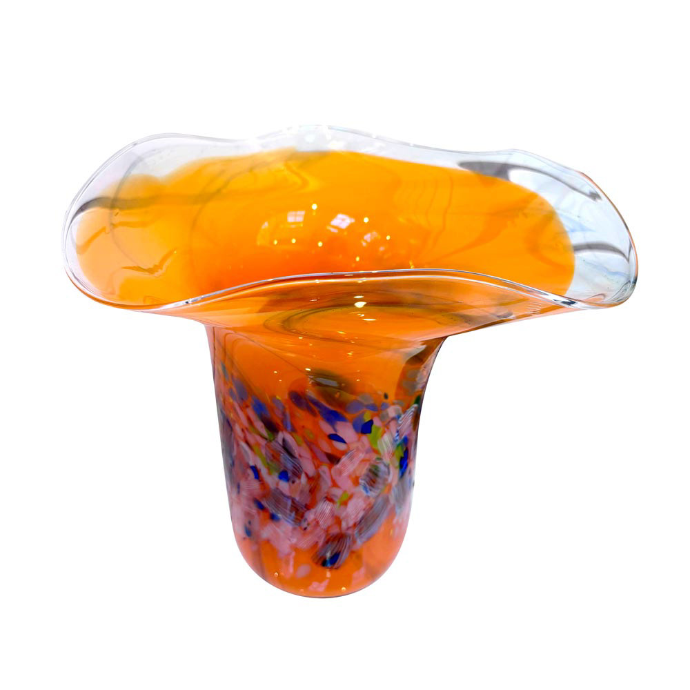
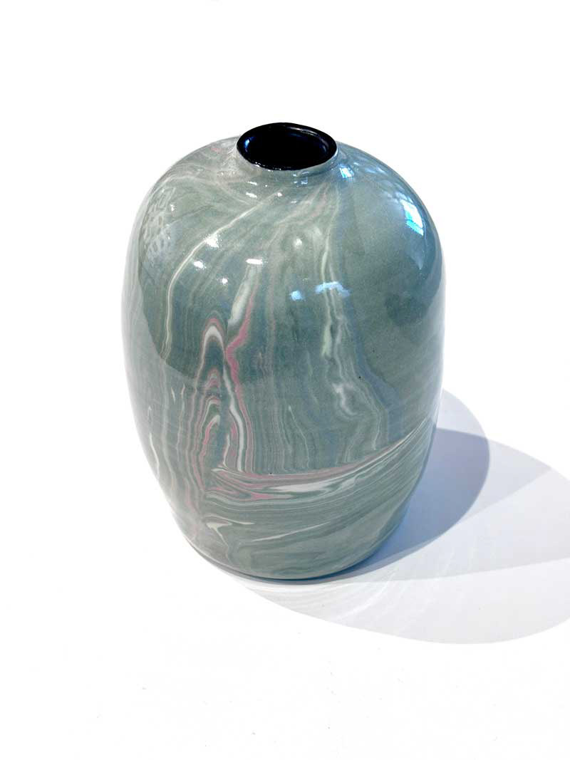
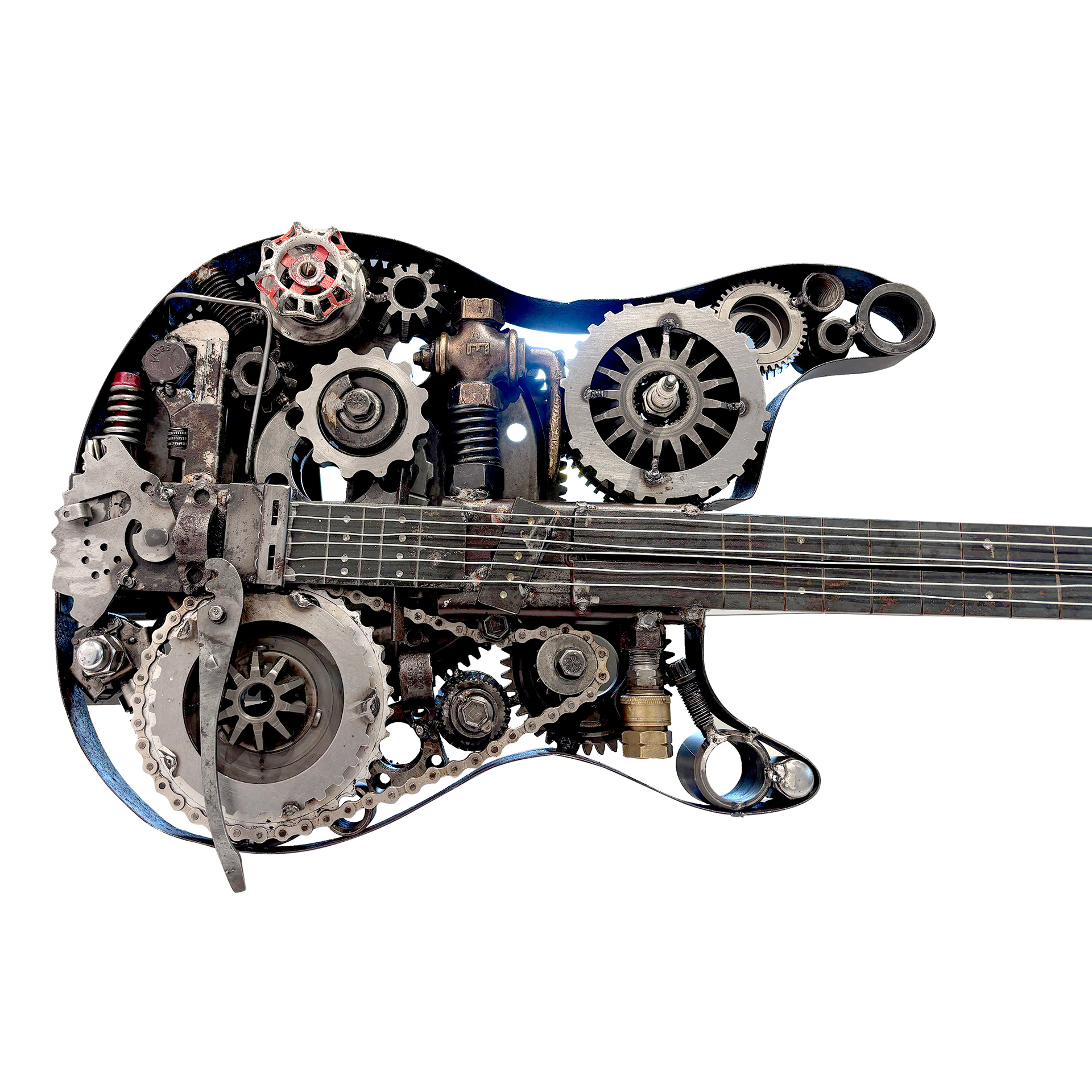
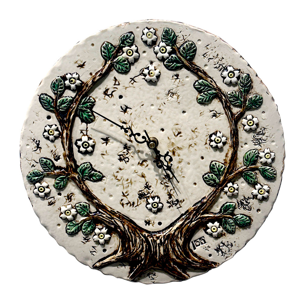
3. Conducted product photoshoots of artworks that highlight the unique features of the artwork and maintained an online library of photo assets
4. Updated post description to include content that provides vital information on the artwork on display to provide users context and encourage engagement
5. Removal of excessive hashtags on social media posts and adding alt text to all images
6. Introduced reels and stories for event behind the scenes, artist processes, and upcoming classes wherever possible
7. Introduced event specific posts i.e. new fall art classes, and studio tours
TEMPLATE UPDATES:
1. Emphasis on artwork where the post highlights unique features and artistic style
2. Logo moved to the right corner where brand visible but not overpowering
3. A red bubble with an updated font arrangement that shows the artist name
4. Use of Instagram carousel to highlight multiple special features of the artwork
2. Logo moved to the right corner where brand visible but not overpowering
3. A red bubble with an updated font arrangement that shows the artist name
4. Use of Instagram carousel to highlight multiple special features of the artwork
VIDEO PRODUCTION FOR SOCIAL MEDIA:
Type 1: Showcasing new products and events while highlighting key features.
Type 2: Sharing processes and behind the scenes of artwork processes.
Type 2: Sharing processes and behind the scenes of artwork processes.
Goal: Gain audience trust by sharing valuable knowledge from art professionals while showcasing finest works from artists to increase community awareness and attract buyers.
Note: The raw videos of artwork processes were shot by the respective artists. My role in these videos was to clean up footage, edit videos, compose frames, add audio, and launch the campaigns. However, I independently shot the product videos and edited them for social media.
ARTWORK PHOTOGRAPHY & DESIGN ASSETS LIBRARY
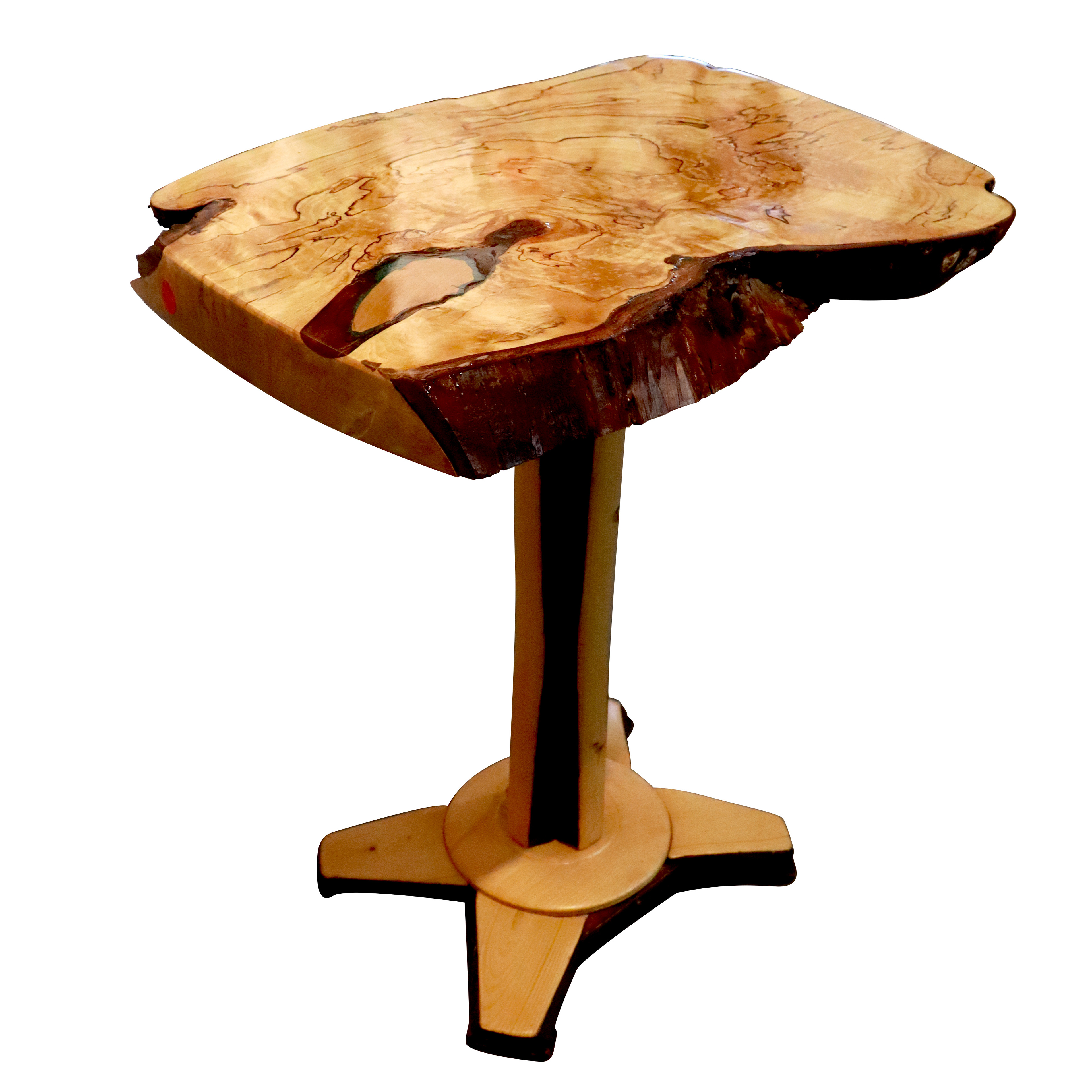
Introduced artwork photography and maintaining an online catalogue of all artworks and other design assets for easier accessibility, organization and maintenance.
WEBSITE OPTIMIZATION
1. Redesigning the website by introducing modern typography, colors, and relevant high quality images from previously organized events, reflecting the vibrant and artistic nature of the gallery
2. Improvising the navigation structure of the website to ensure a seamless and engaging experience for website visitors
3. Developing social influence of the gallery by linking to press releases, showcasing awards won by the gallery, and integrating social proof to highlight the gallery's achievements and community involvement
4. Using insights from Google Search Console and Google Analytics data to enhance SEO, improve impression rate, and online visibility across search engines
5. Revising and rewriting copy to promote and communicate Watershed Artworks Gallery's brand message clearly
6. Analyzing user behaviour using heatmaps and make suggestions to improve user click through, bounce rate, and improve
user retention
INTRODUCING "REDISCOVER"
CAMPAIGN GOALS:
Reframe Local Art: Encourage the public to see familiar artworks in a new light, promoting a deeper understanding and connection to the art and artists who created it.
Fundraise for Community Events: Generate funds to support Watershed Artworks Gallery's initiatives, providing engaging experiences for the community through art and culture.
Support Local Artists: Celebrate the contributions of local artists and provide a platform for their work to be showcased and appreciated.
OTHER MICRO CHANGES TO THE WEBSITE
- Added informational text to each event page and improved UI for intuitive navigation
- Improvised artist page layout within the constraints of Squarespace platform
- Formatted all images from 300 dpi to 72 dpi and improved page speed performance
- Retouched and updated graphic assets like thumbnails and icons across all webpages
- Made SEO changes until Lighthouse SEO score and accessibility score reached at least above 90%
- Updated website graphics across digital channels


RESULTS
Within 2 months of these changes including a new professional art blog, adding SEO keywords, and fresh visual assets, the website impressions increased by over 70 percent!
VIEW MORE PROJECTS:
